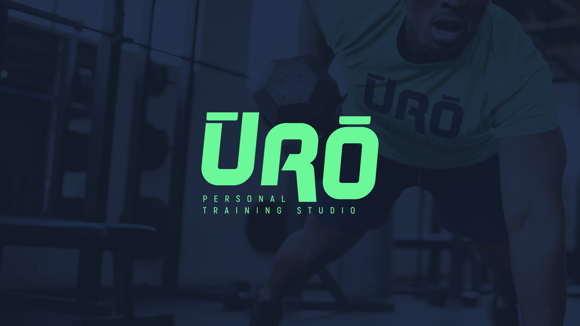
ŪRŌ is the personal brand of a professional trainer built around a single, powerful idea: to burn, and to keep alight. Derived from Latin, ŪRŌ isn't just a name, it's a philosophy. It captures the trainer's essence: the drive to ignite something in her clients, and the discipline to keep that fire burning long after the session ends. My job was to translate that meaning into a visual identity as sharp and intentional as the woman behind it.
Problem
Personal trainer brands live or die by distinctiveness. The fitness space is saturated with bold fonts, neon palettes, and motivational clichés. ŪRŌ needed to stand apart, premium without being cold, powerful without being aggressive, and deeply personal without being generic.
solution
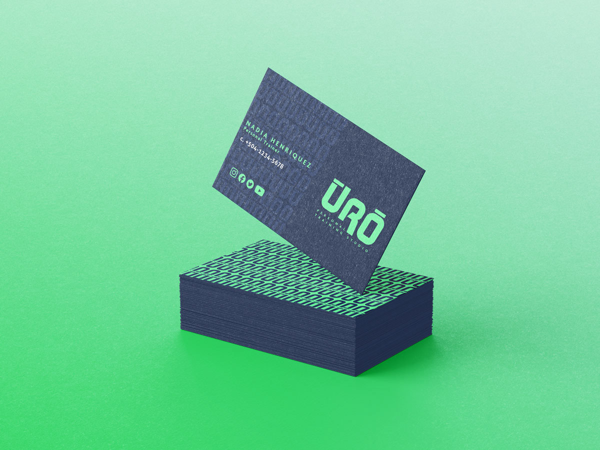
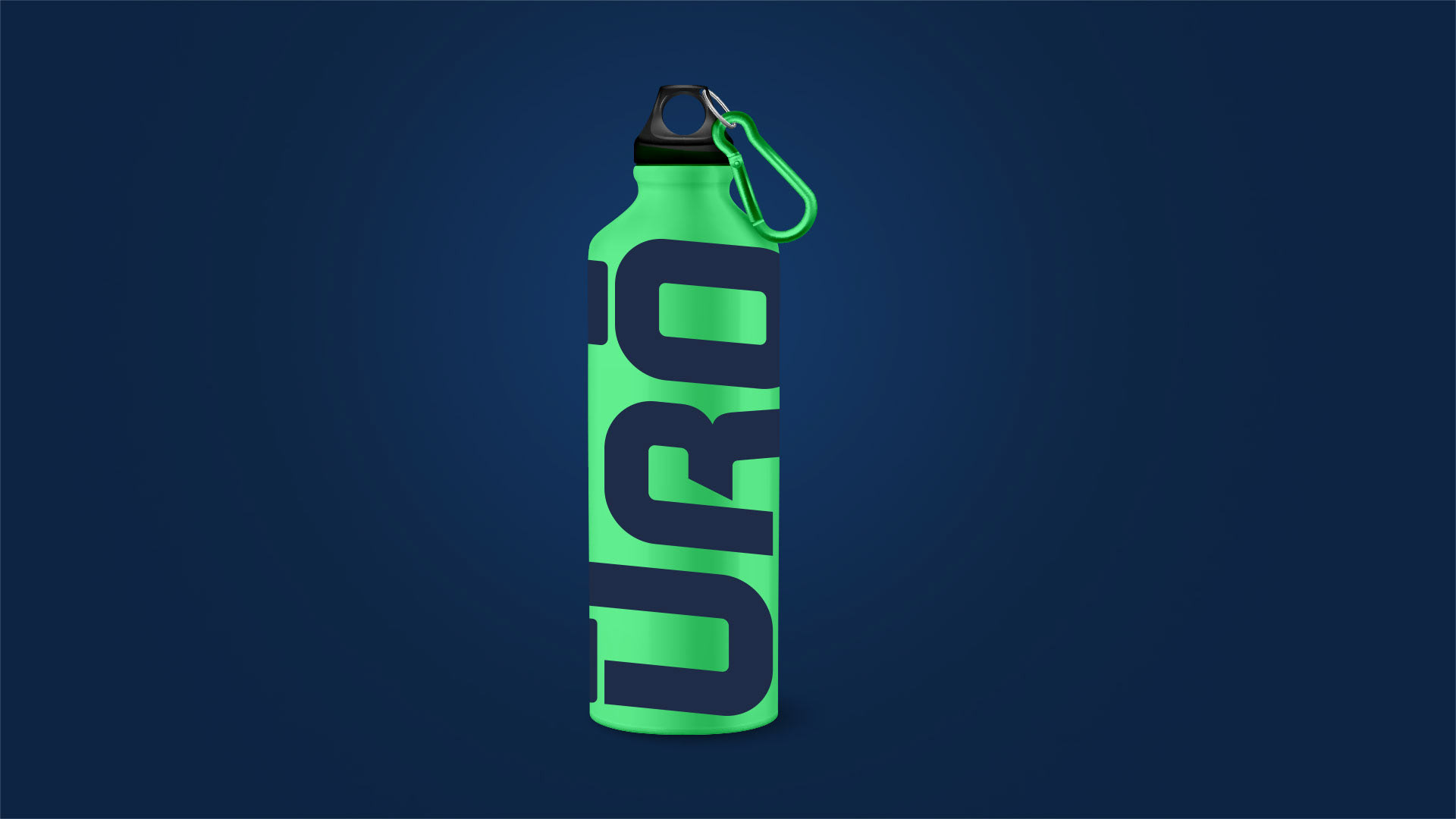
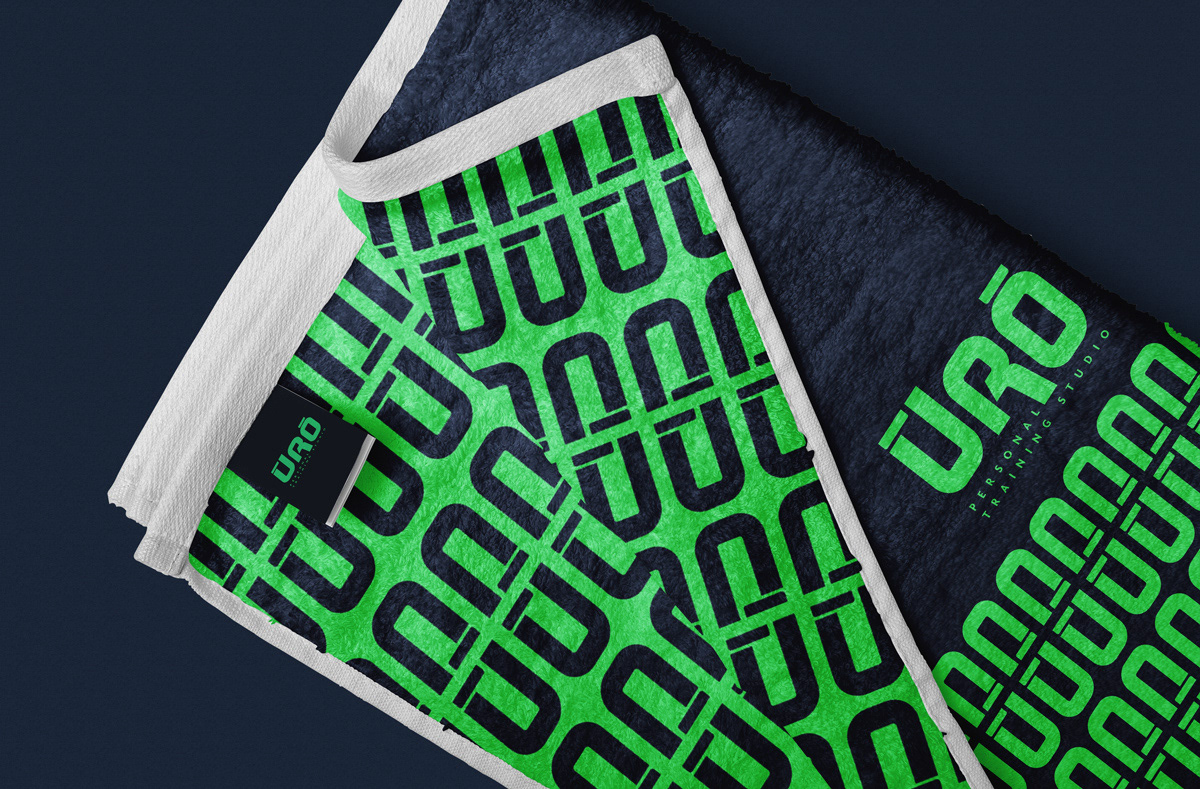
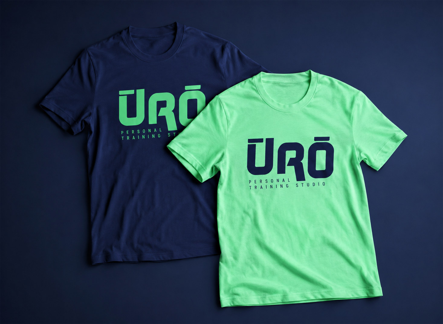
I worked conceptually around the word. Those two macrons, Ū and Ō, didn't just have diacritical purposes, they're a visual signature that was made to stand out. The wordmark was built around that rhythm and symmetry created by both macrons, giving ŪRŌ an identity that's instantly recognizable even at small sizes.
From there, the system was built to feel alive and powerful. A logomark and wordmark designed to work across digital and physical touchpoints. And a color palette rooted in intensity using dark foundations with warm, ember-like accents.


DELIVERABLES
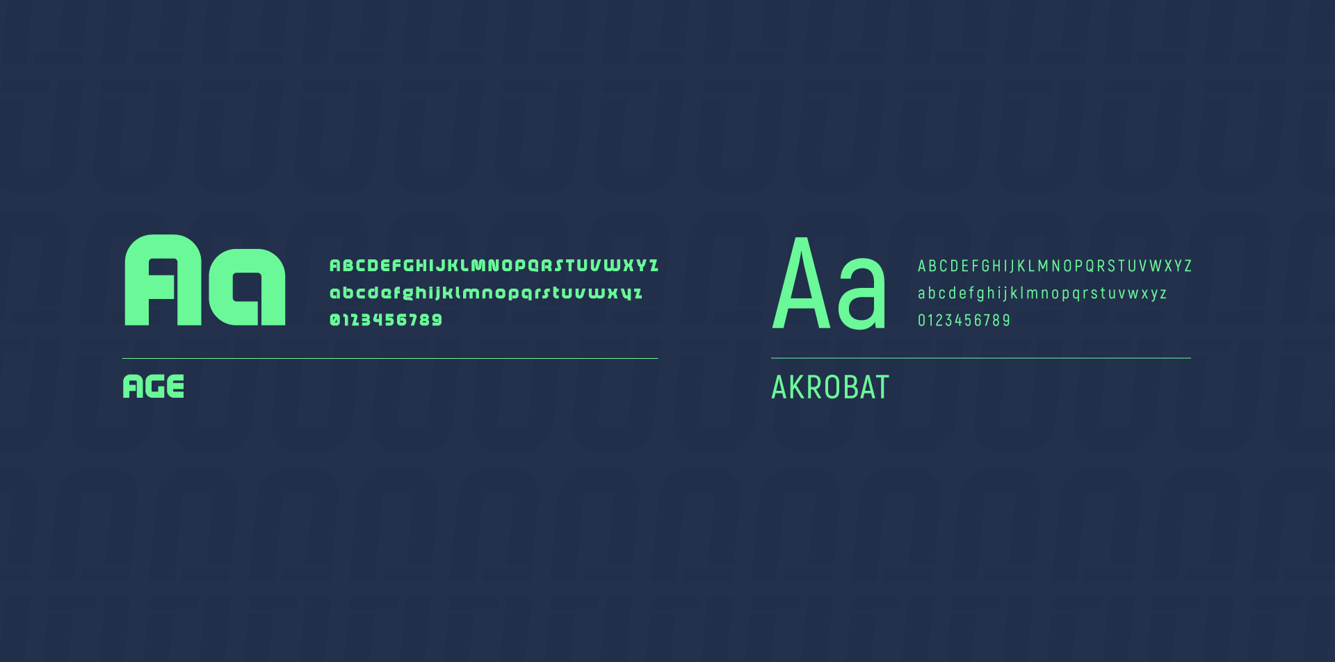
Logo & Wordmark · Color & Typography · Apparel Mockups
Logo & Wordmark · Color & Typography · Apparel Mockups
INDUSTRY
Health & Fitness / Personal Branding
Health & Fitness / Personal Branding