A YouTube channel is a brand touchpoint that most companies underinvest in. At Supra, we treated the thumbnail system as a real design problem: how do you make a blockchain company's content stop a scroll, communicate instantly, and feel consistent across dozens of videos covering completely different topics?
The brief
Increase click-through rate and make Supra's content stand out in a crowded crypto YouTube space. The channel covered everything from product demos and developer tutorials to keynote presentations and partnership announcements. Each content type needed its own visual approach while still feeling like it came from the same brand.
THE SYSTEM
Rather than designing thumbnails one by one, I built a multi-format system with three distinct templates, each suited to a different content type.
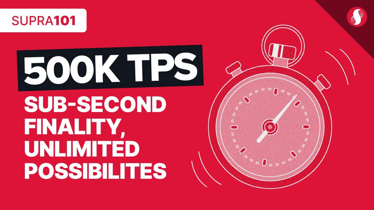
Supra 101 series
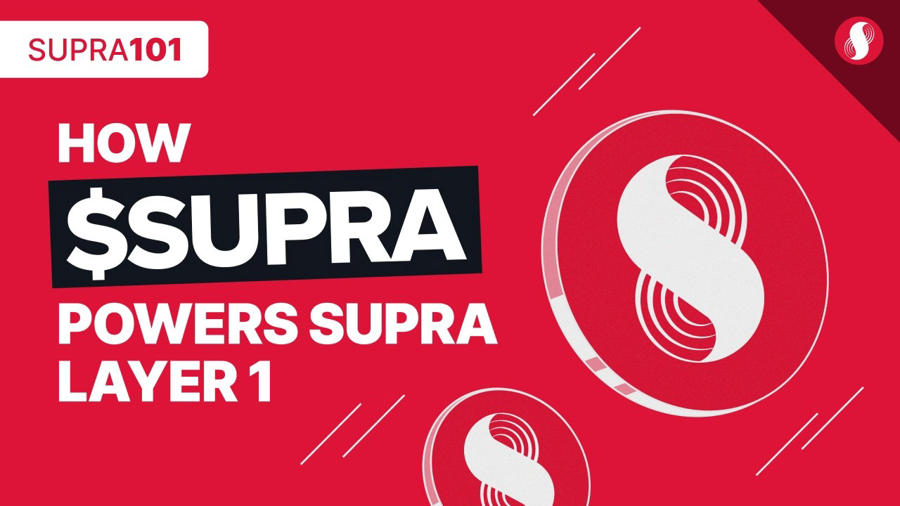
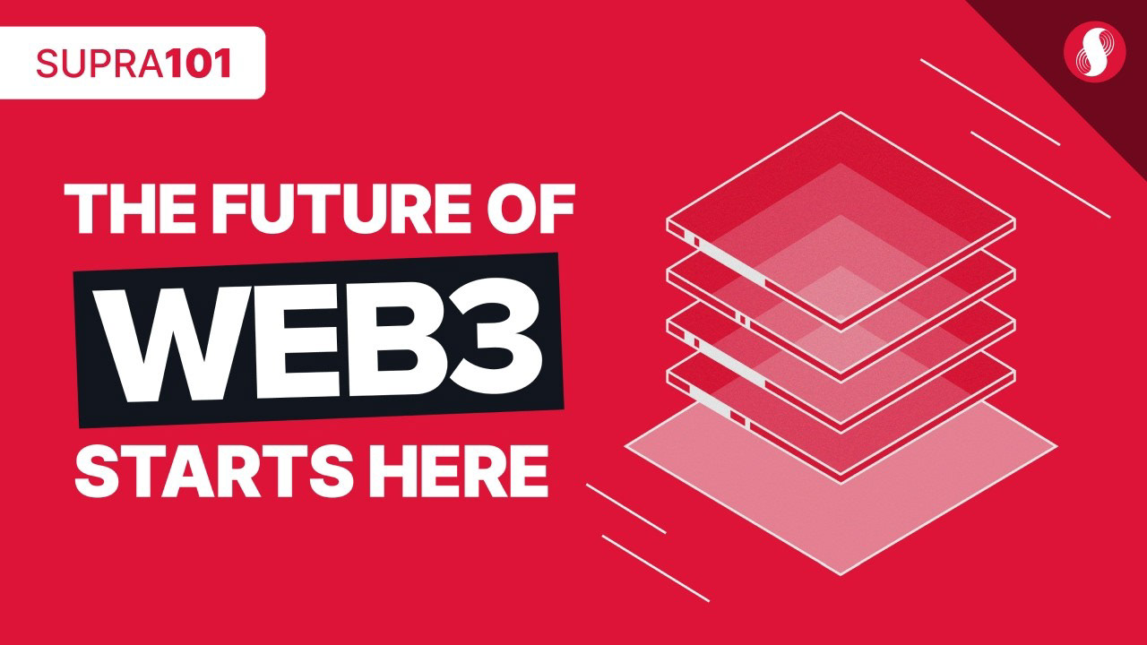
A clean, graphic format built entirely around brand assets. Red background, white typography, illustrative icons. No faces, no noise. Designed to communicate a technical concept at a glance and stand out through simplicity in a feed full of busy thumbnails.
A clean, graphic format built entirely around brand assets. Red background, white typography, illustrative icons. No faces, no noise. Designed to communicate a technical concept at a glance and stand out through simplicity in a feed full of busy thumbnails.
Keynote and event thumbnails
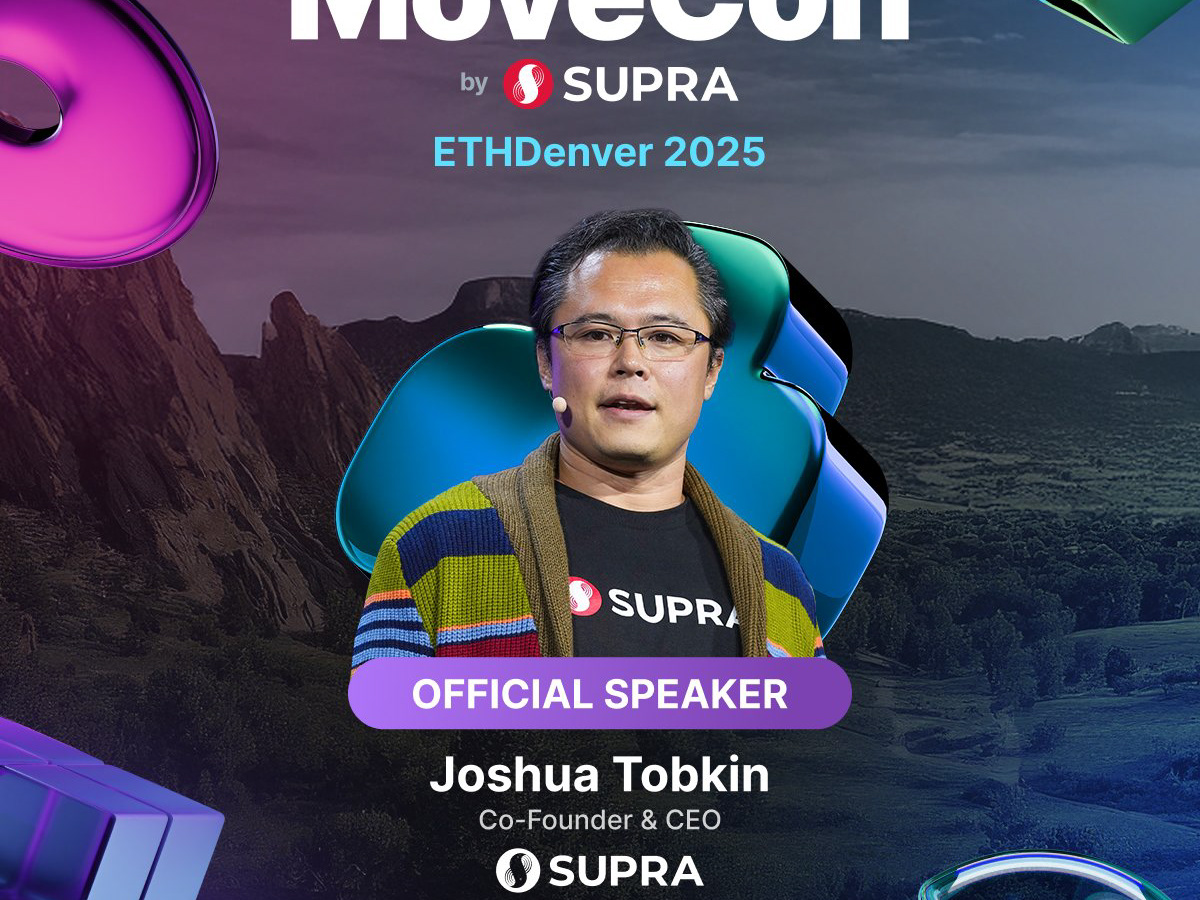
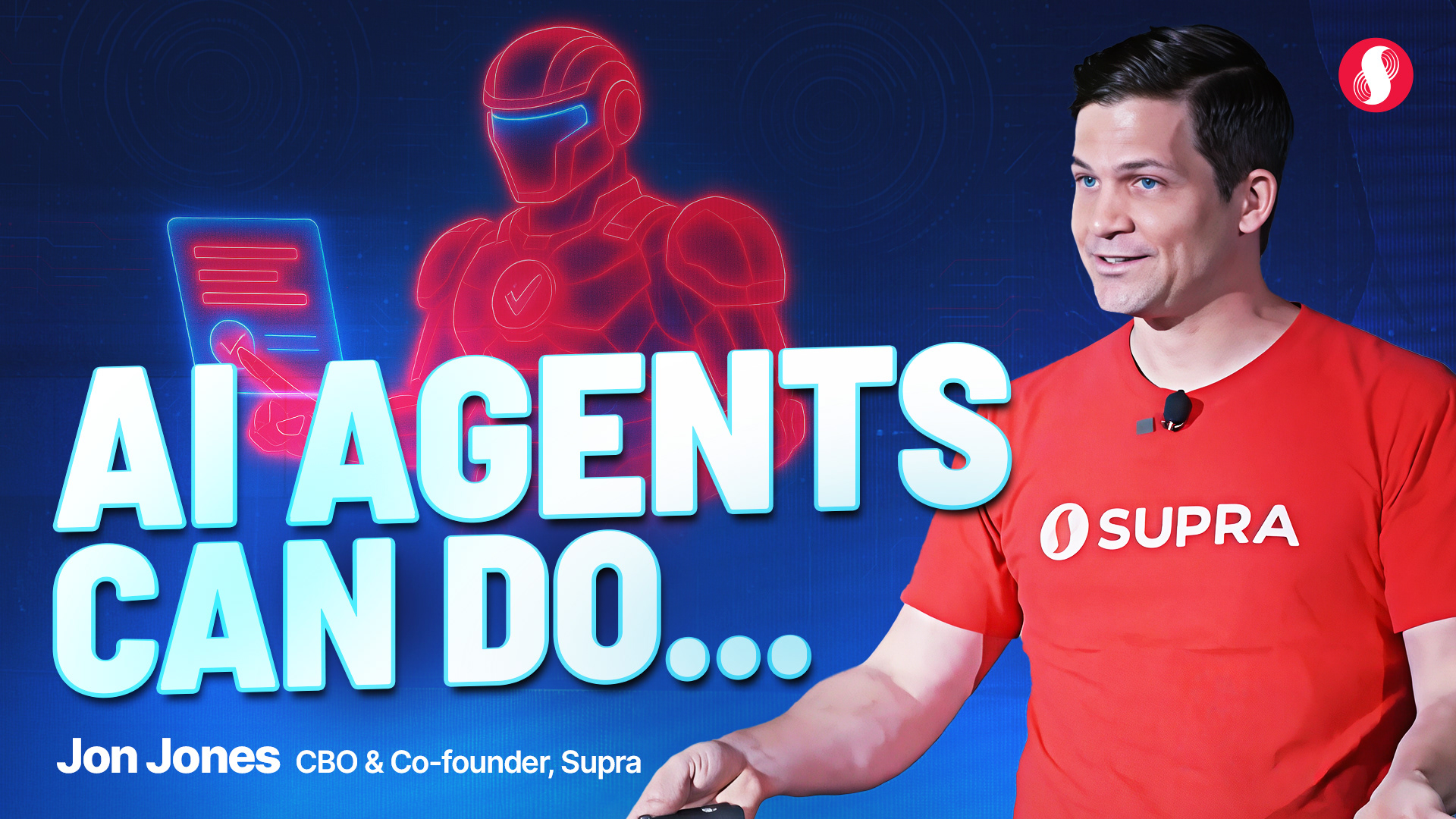
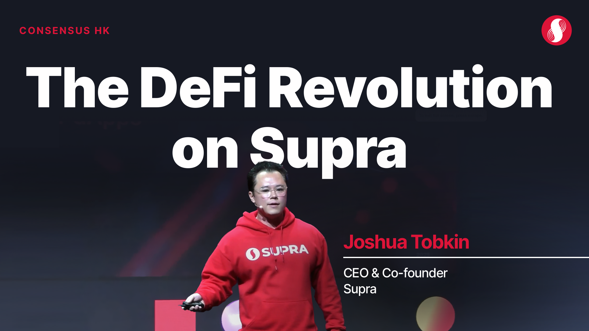
Built around real photography of Supra executives and speakers. Bold title treatment, event context, and a clear visual hierarchy that made the subject and topic readable at small sizes.
Built around real photography of Supra executives and speakers. Bold title treatment, event context, and a clear visual hierarchy that made the subject and topic readable at small sizes.

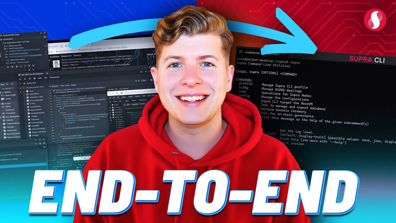
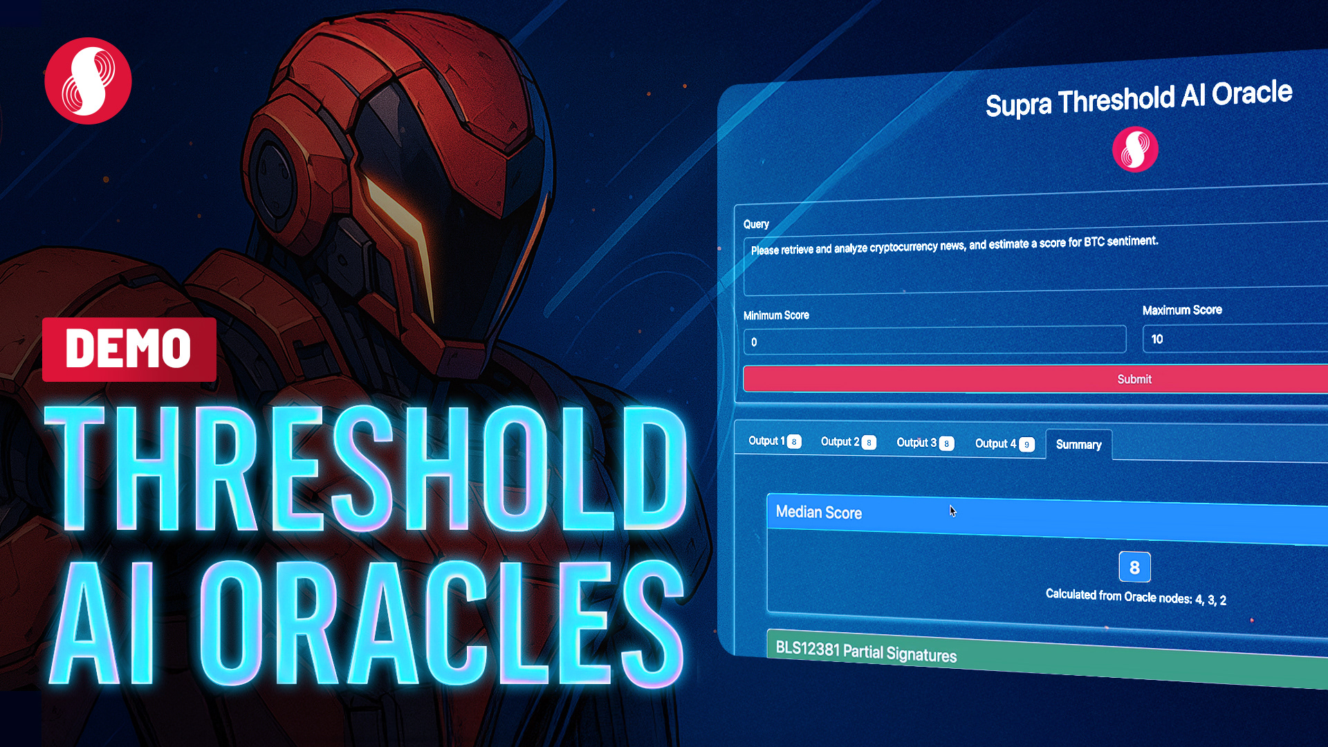
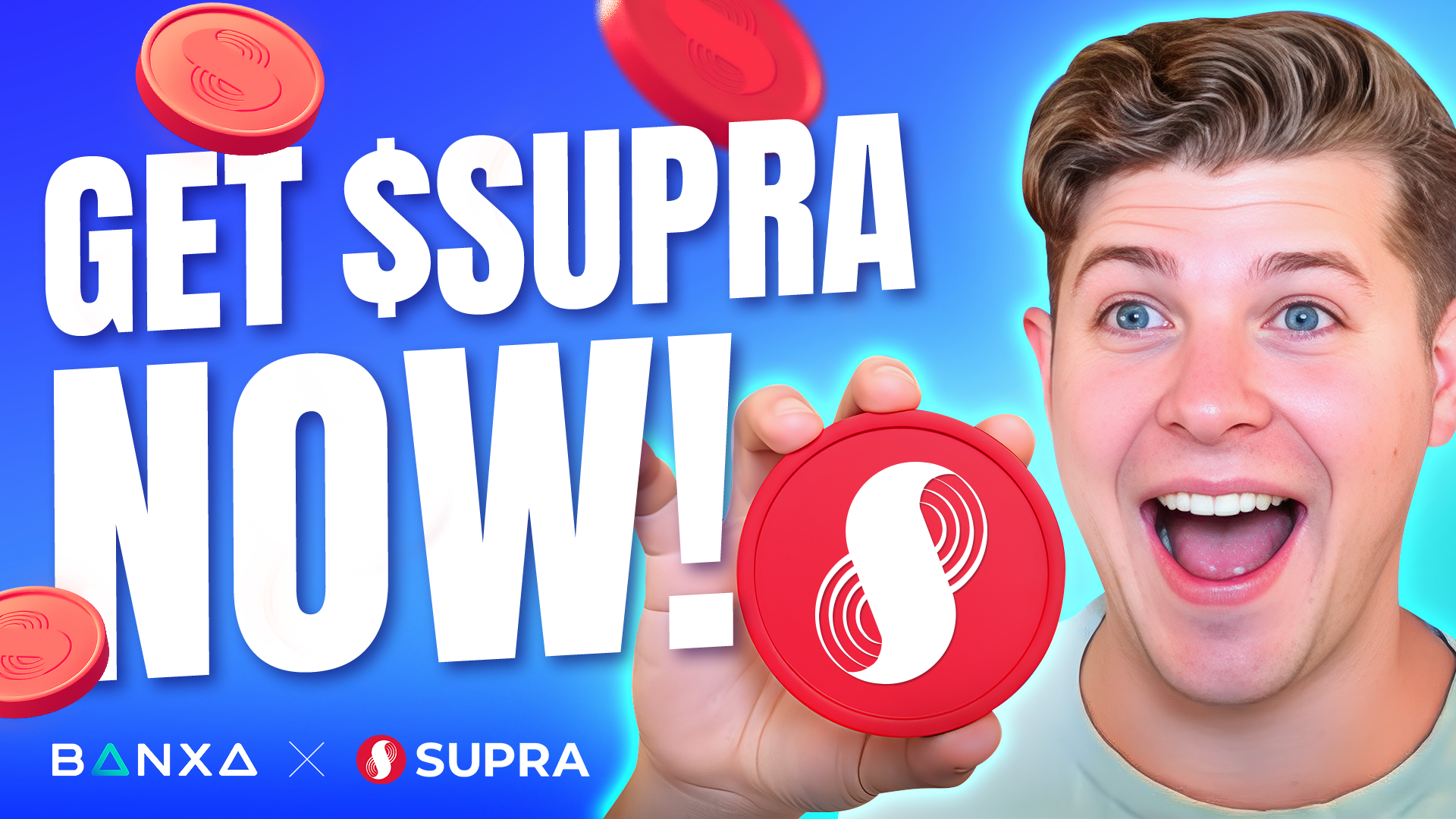
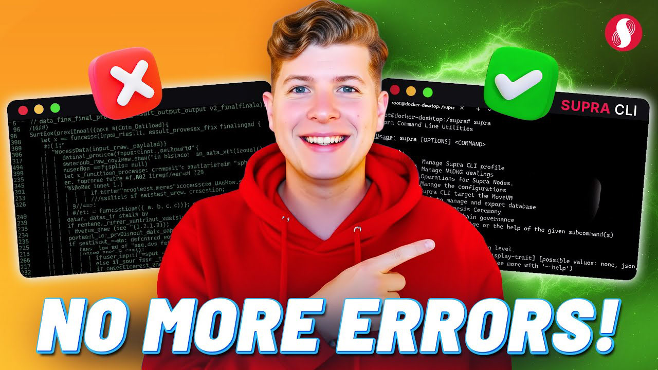
Tutorial and demo thumbnails
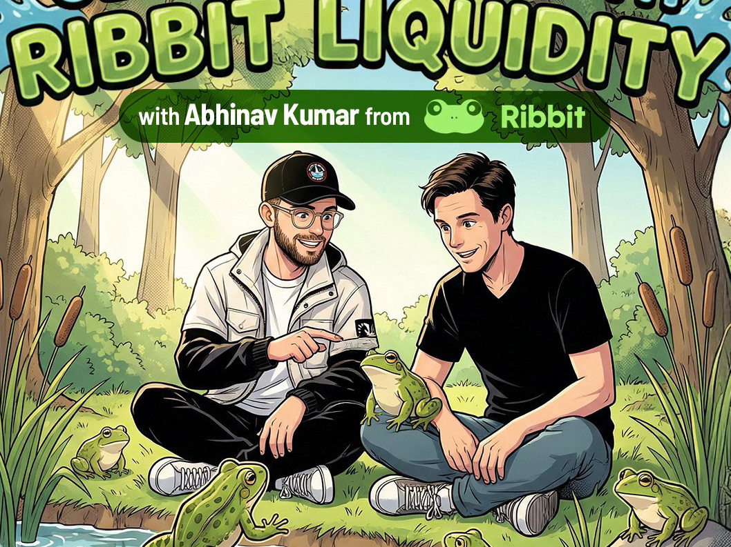
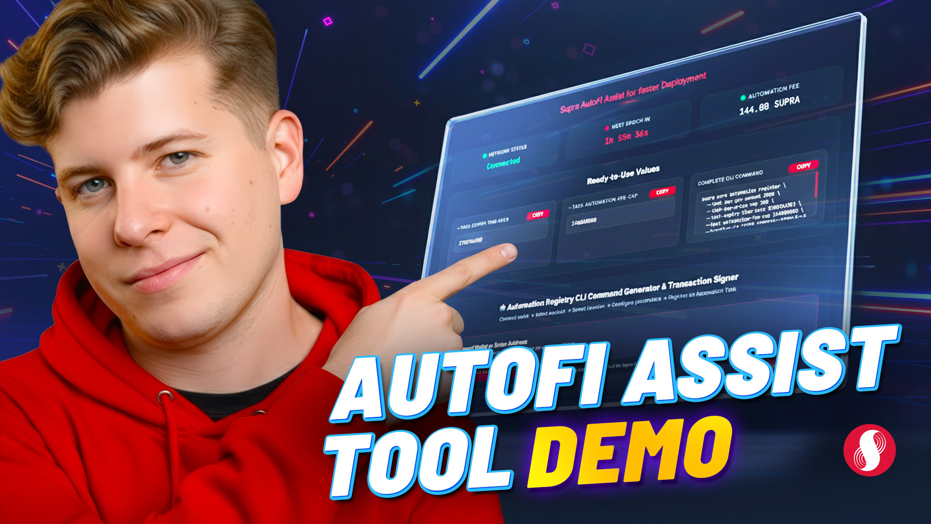
High-energy, reaction-forward format with bold expressive text and bright color. Designed to drive curiosity and clicks on how-to and product walkthrough content.
High-energy, reaction-forward format with bold expressive text and bright color. Designed to drive curiosity and clicks on how-to and product walkthrough content.

Data-informed decisions
I ran A/B tests on the Supra 101 series, testing a red background treatment against a blue alternative. The red variant outperformed across the board and became the established direction for the series going forward. The top performing video in the series reached 4.3K views, with consistent performance across the full playlist.
The result
A scalable thumbnail system that covered multiple content categories without losing channel-level consistency. Each format was documented and repeatable, giving the team a clear visual language to work from as the channel grew.
ROLE
Brand Designer · Supra · 2023–2026
Credits
Creative Supervision: Luying Yeo