Supra Spartans was already a community, passionate, active, and growing. What it didn't have was a brand that matched that energy. The existing identity was inconsistent, generic, and didn't reflect the ambition of what the program was becoming. The brief was clear: make it premium, make it cinematic, make it feel like something people would want to belong to.
The challenge
The previous Supra Spartans identity leaned on AI-generated imagery without a visual system behind it. Each cohort launch felt disconnected from the last. There was no typographic standard, no color discipline, no character consistency. For a loyalty program built on community pride and belonging, the brand wasn't doing its job.
The REFERENCE
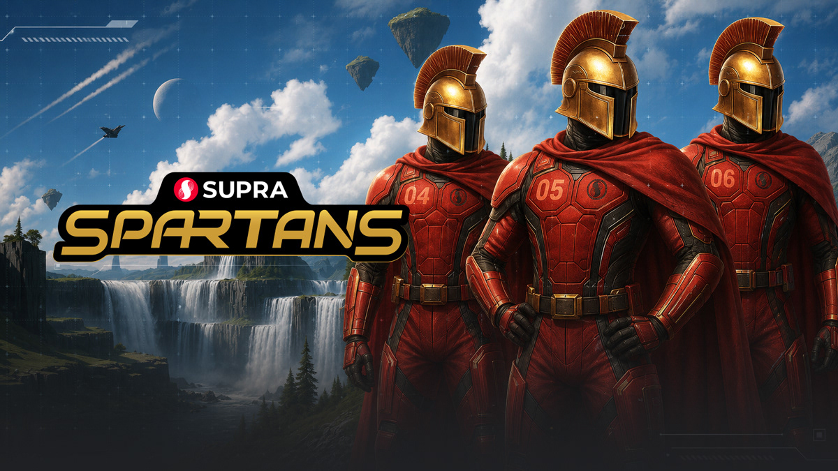
The direction we agreed on was Halo, not literally, but in feeling. Futuristic armor. Cinematic scale. The sense that being a Spartan meant something. That was the creative north star for everything that followed.
Concept overview
Supra Spartans is a tiered global ambassador program designed to cultivate en elite community of blockchain enthusiasts, devs, and thought leaders dedicated to advancing Supra's mission. Spartans are not just advocates, they are front-line explorers of the future web3, helping drive adoption, foster education, and amplify Supra's impact across the ecosystem.
Spartans are envisioned as an elite force. A brotherhood and sisterhood of pioneers equipped with advanced knowledge and tools, operating at the cutting edge of blockchain.
What I built
A complete brand system from scratch:
Logo and wordmark
A custom typographic treatment for "Spartans" that balanced weight and craft, paired with the Supra parent brand mark in a clear hierarchy.
A custom typographic treatment for "Spartans" that balanced weight and craft, paired with the Supra parent brand mark in a clear hierarchy.
Color palette
Deep charcoal and black as the foundation, gold as the primary brand accent, red as the action color. Disciplined, premium, and scalable.
Deep charcoal and black as the foundation, gold as the primary brand accent, red as the action color. Disciplined, premium, and scalable.
Typography
Industry Ultra for display, paired with a secondary face for body and UI contexts. Chosen for its mechanical, futuristic edge.
Industry Ultra for display, paired with a secondary face for body and UI contexts. Chosen for its mechanical, futuristic edge.
Levels Icons
A family of triangular shield-based icons built around a consistent visual language, usable across digital and merchandise contexts.
Official emblem
A circular badge lockup that gave the program a heraldic, membership-worthy identity.
A family of triangular shield-based icons built around a consistent visual language, usable across digital and merchandise contexts.
Official emblem
A circular badge lockup that gave the program a heraldic, membership-worthy identity.
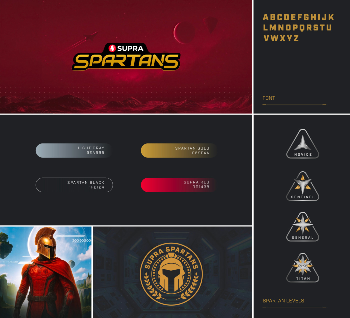
Spartans Design
I art directed every Spartan character image using AI, defining the helmet design, uniform details, armor plating, cape treatment, and environmental context through iterative prompting. Every visual decision, from the details on their chest to the floating landscape backgrounds, was defined by me before a single image was generated.

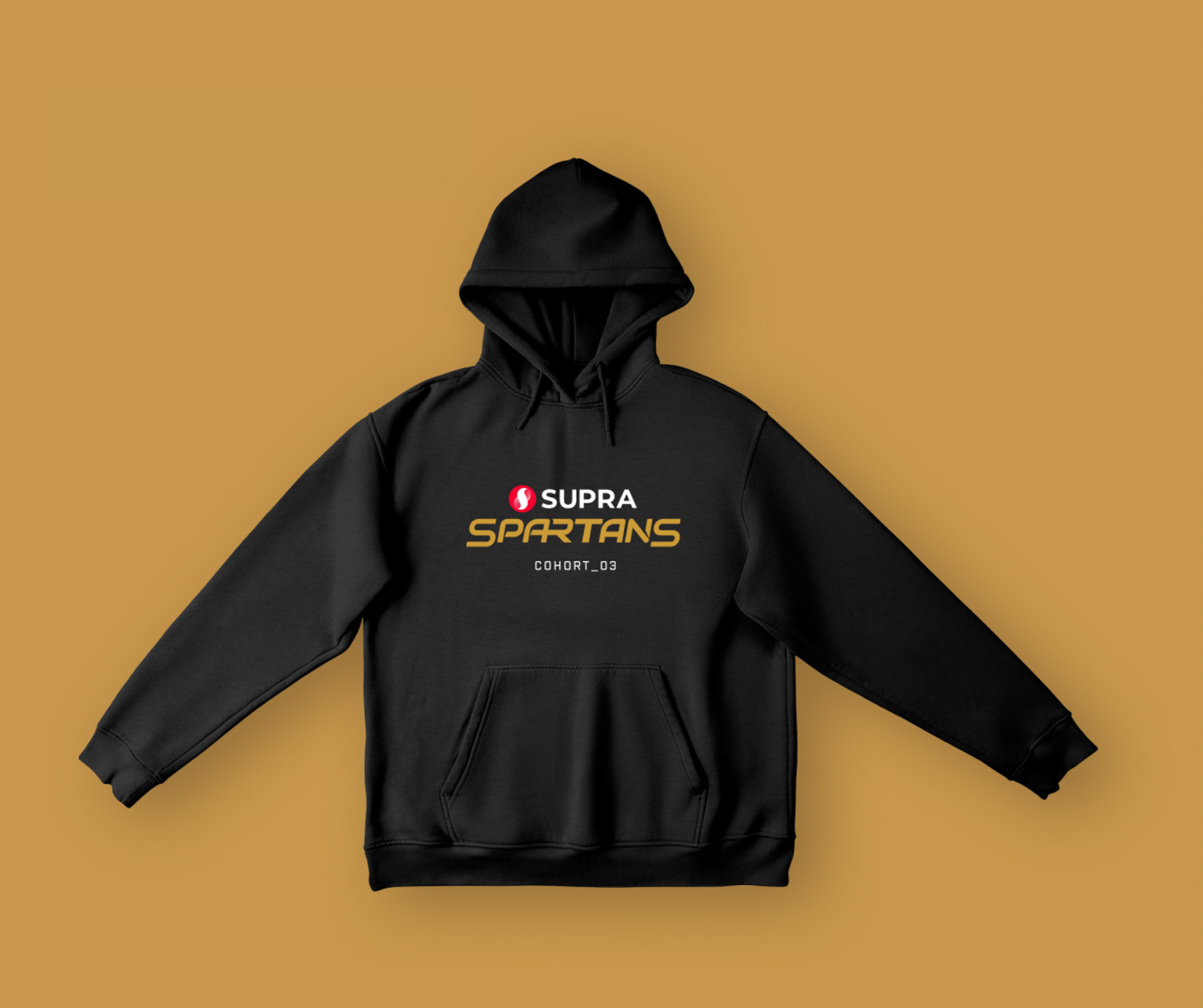
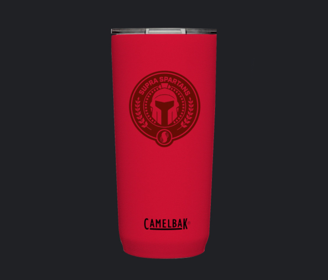
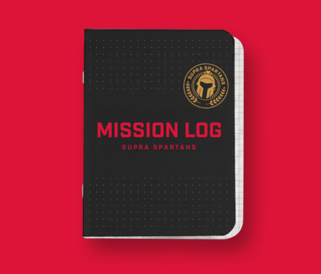
Merchandise design
Hoodie, tumbler, and notebook mockups that extended the brand into physical touchpoints.
Hoodie, tumbler, and notebook mockups that extended the brand into physical touchpoints.
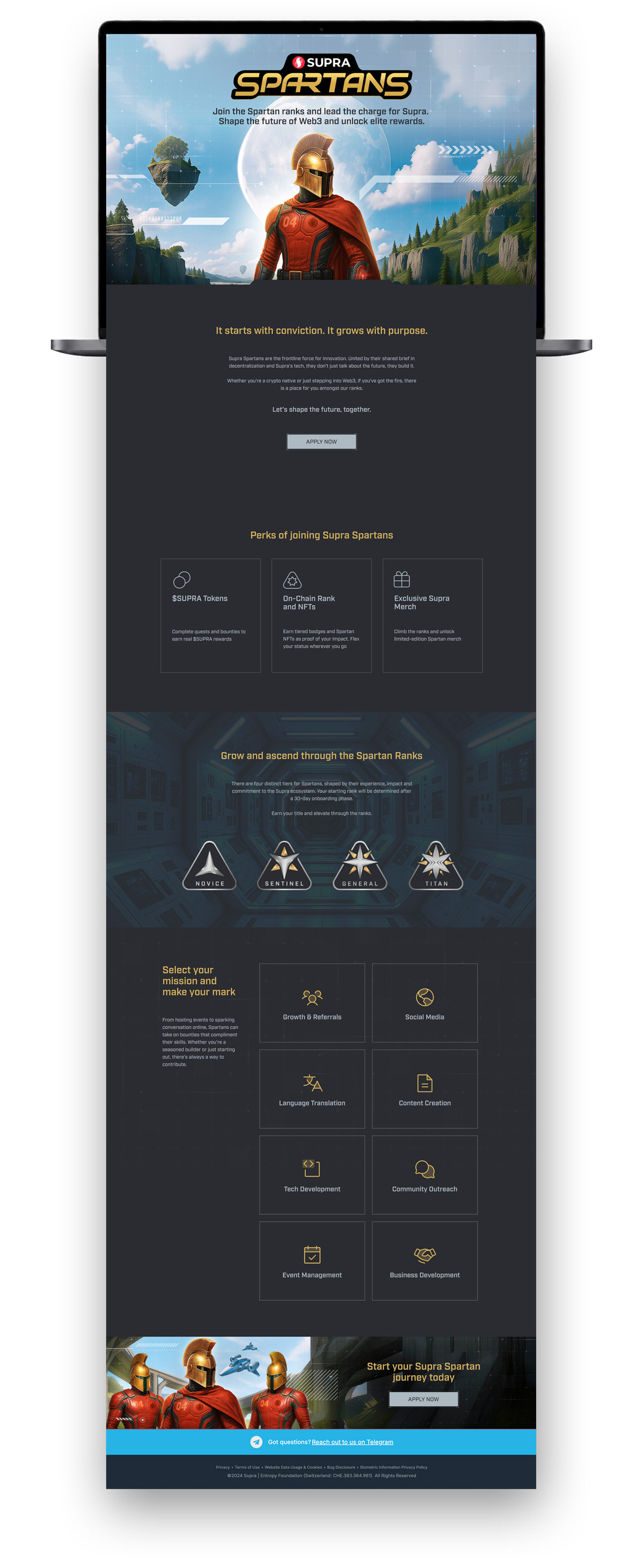
Landing page
Designed the full layout and UX structure, which was later built by the web development team exactly as spec'd.
The result
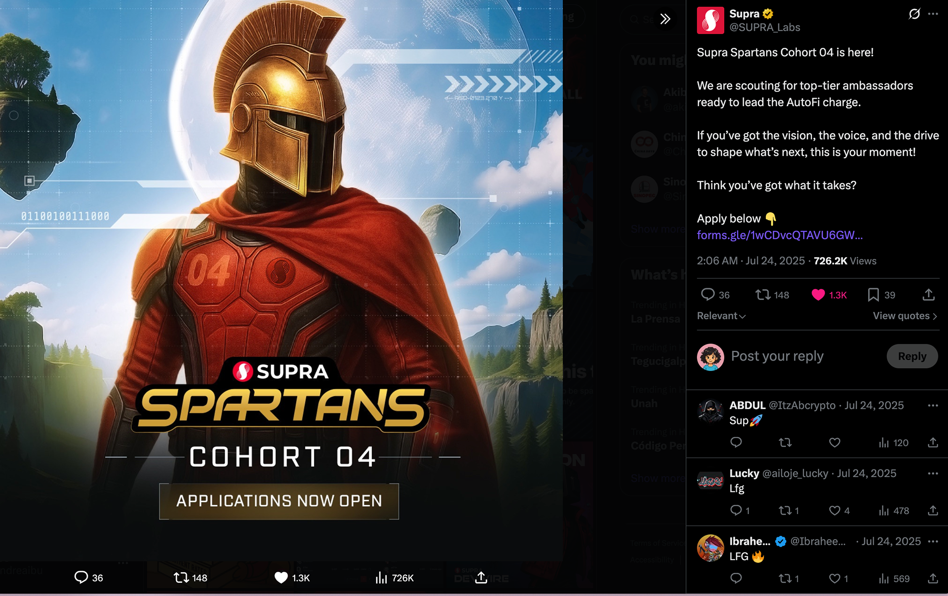
The rebrand launched publicly in 2025 with Cohort 04 and was immediately embraced by the community. It became one of the most praised projects of my time at Supra, internally and externally.
ROLE
Brand Designer & Art Director · Supra · 2025
Credits
Creative Supervision: Luying Yeo