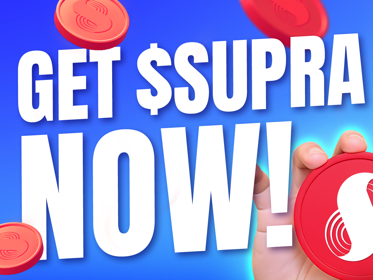
The SUP was Supra's weekly livestream podcast, bringing blockchain industry guests to talk crypto, DeFi, and everything building on Supra. It needed a visual identity that could do two things at once: feel native to Web3 and stand out in a feed full of dark, generic crypto content. My job was to build that identity from scratch and keep it alive, fresh, and consistent across every episode.
The brief
A weekly podcast needs a visual system that works at volume. Every episode required a unique thumbnail that could stop a scroll, communicate the topic instantly, and still feel unmistakably like The SUP. The challenge wasn't making one great image. It was making a lot of them without any of them looking like they came from a template.
The concept
The direction I chose was modern manga illustration. Manga sits at the intersection of tech culture, internet-native aesthetics, and visual storytelling. It felt native to the Web3 audience without leaning into the typical dark, edgy crypto look everyone else was doing. It was a cartoon sensibility without being childish, energetic without being loud. The illustrations were created using AI image generation, with every detail, environment, character, lighting, and mood defined through careful art direction and refined in Photoshop.
What I built
Logo
I designed the full SUP wordmark and brand lockup from scratch. Clean, bold, and built to sit consistently in the lower left corner of every thumbnail and social media post without ever competing with the episode art.
Character system
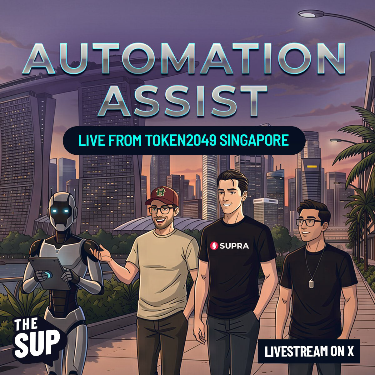
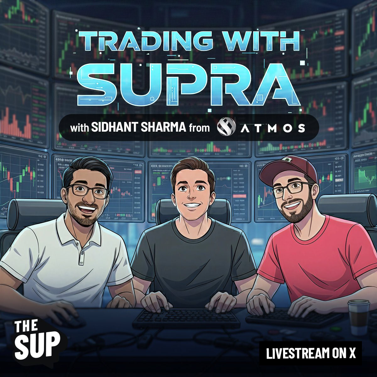
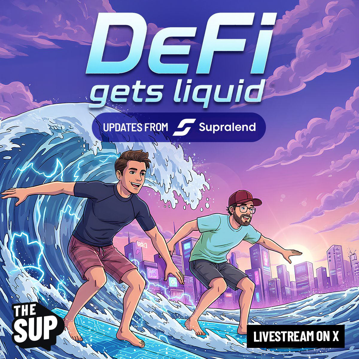
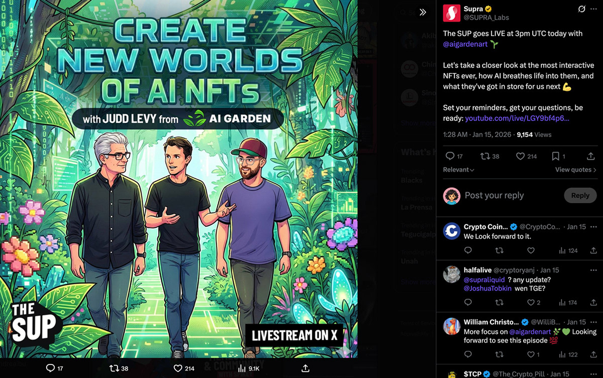
The two main hosts were illustrated as consistent manga characters across all episodes. Same faces, same proportions, same energy. Recognizable from thumbnail to thumbnail regardless of the scene they were placed in.
The two main hosts were illustrated as consistent manga characters across all episodes. Same faces, same proportions, same energy. Recognizable from thumbnail to thumbnail regardless of the scene they were placed in.
Episode art direction
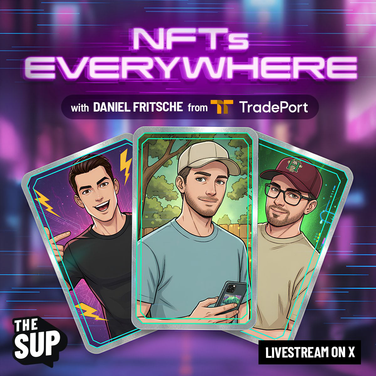
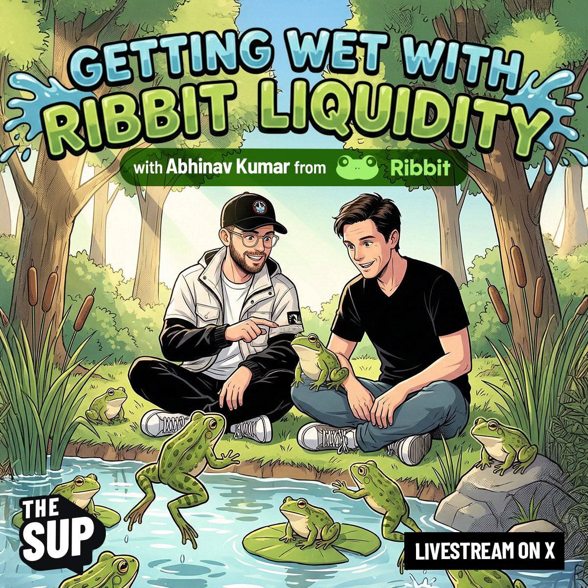
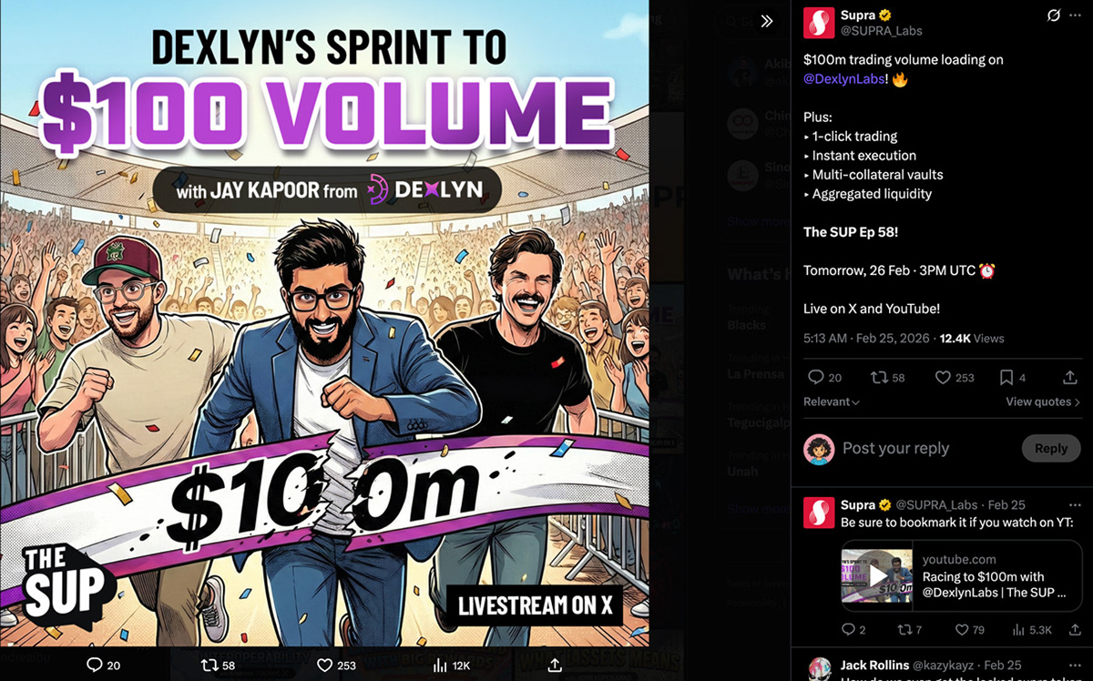
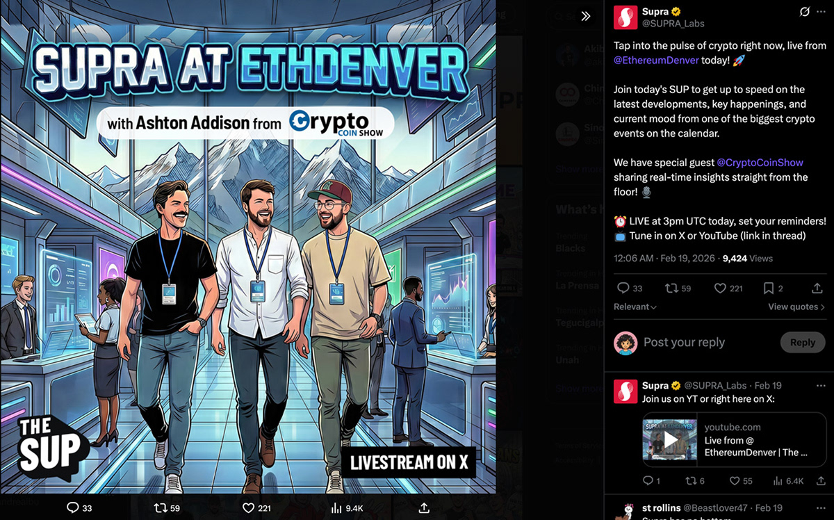
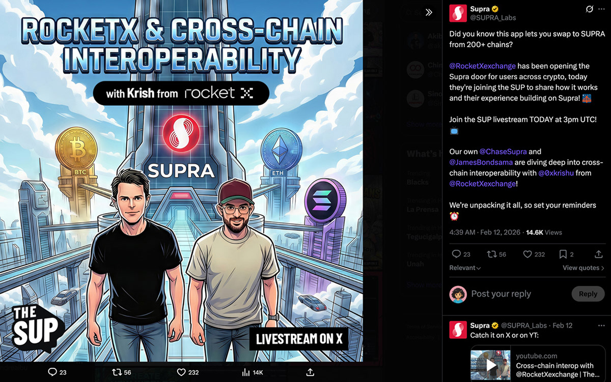
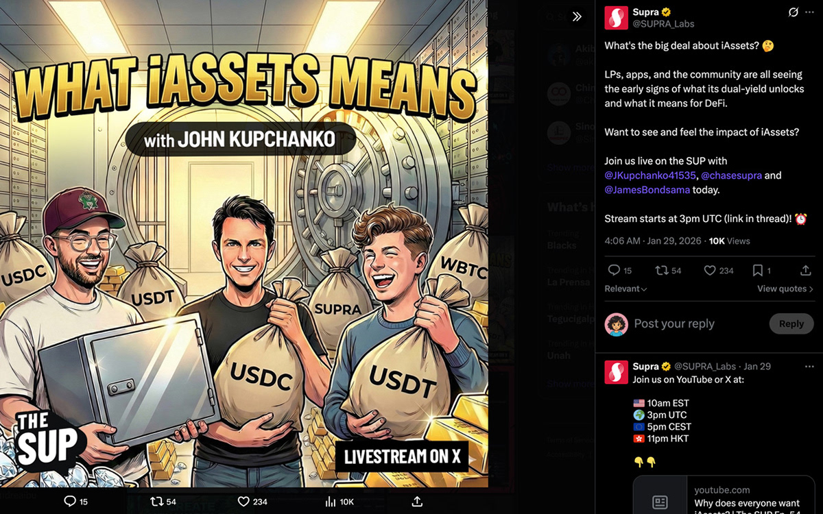
Every episode got a completely unique concept built around the guest's topic. A bank vault full of money bags for an iAssets episode. A frog swamp for a liquidity protocol. A rocket launch for a new project debut. A cyberpunk neon room for Smart NFTs. Surfing a wave through a DeFi cityscape. Each scene was conceptualized, prompted, and refined in Photoshop before it went live.
Every episode got a completely unique concept built around the guest's topic. A bank vault full of money bags for an iAssets episode. A frog swamp for a liquidity protocol. A rocket launch for a new project debut. A cyberpunk neon room for Smart NFTs. Surfing a wave through a DeFi cityscape. Each scene was conceptualized, prompted, and refined in Photoshop before it went live.
Typography
The episode title treatment adapted its style to match each concept while maintaining typographic consistency across the series. The title was part of the art, not placed on top of it.
The episode title treatment adapted its style to match each concept while maintaining typographic consistency across the series. The title was part of the art, not placed on top of it.
Production workflow
Every thumbnail was generated through AI prompting with detailed art direction defining environment, lighting, character positioning, guest likeness approximation, and mood, then refined and composited in Photoshop. The workflow was built to deliver a polished asset on a weekly deadline without compromising quality.
Every thumbnail was generated through AI prompting with detailed art direction defining environment, lighting, character positioning, guest likeness approximation, and mood, then refined and composited in Photoshop. The workflow was built to deliver a polished asset on a weekly deadline without compromising quality.
The result
Weekly episodes over the course of the show's run, each with a unique visual identity delivered on deadline. Top-performing episodes reached over 12K views on announcement posts alone. The thumbnail system became one of the most recognizable visual formats in Supra's social presence, and the character consistency meant audiences always knew they were watching The SUP before they read a single word.
A note on process
This project proved something I believe about AI-assisted design: the tool only works as well as the creative direction behind it. The scenes weren't generated, they were designed. The environments, the character positions, the lighting, the guest integration, every detail was a decision made before a single prompt was written.
ROLE
Brand Designer & Art Director · Supra · 2025–2026
Credits
Creative Supervision: Luying Yeo