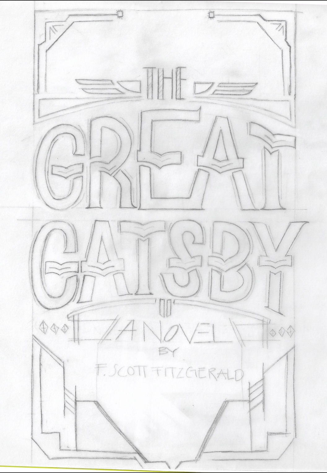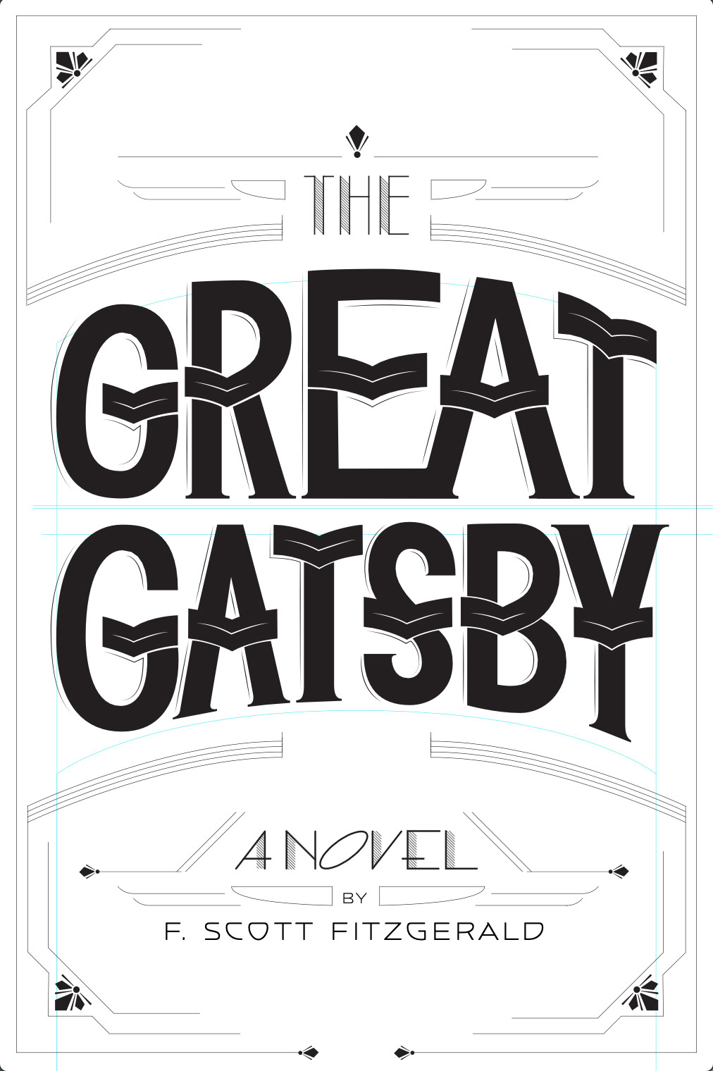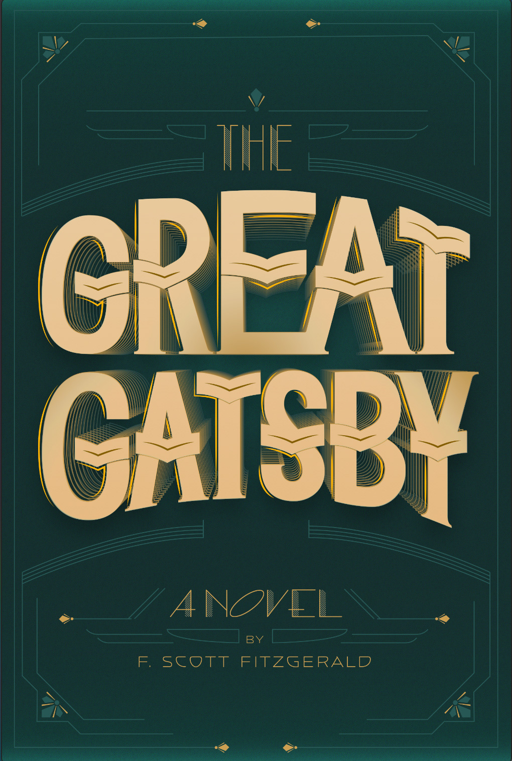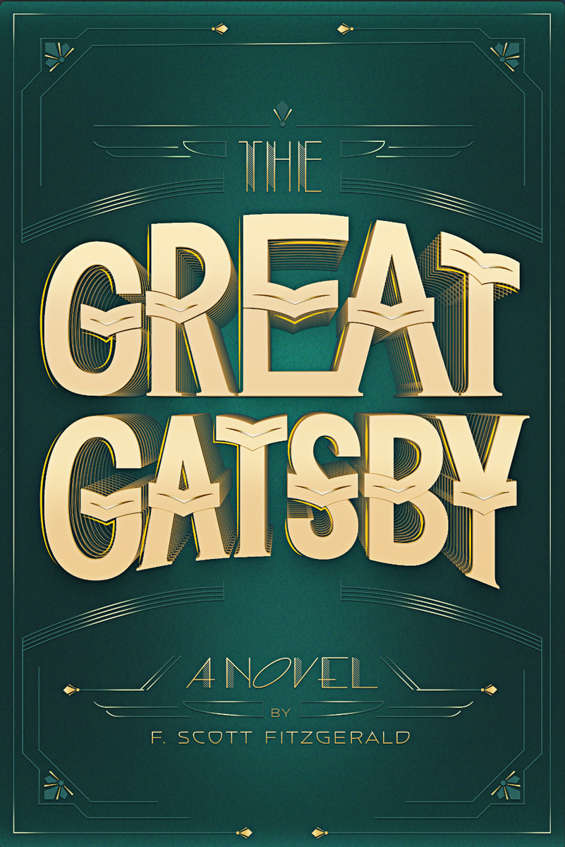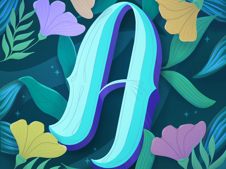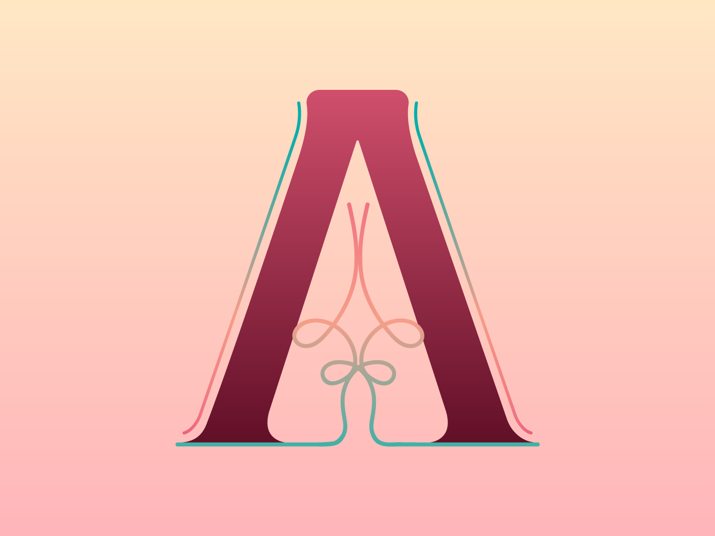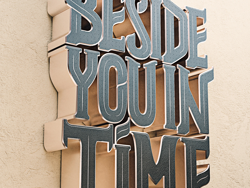
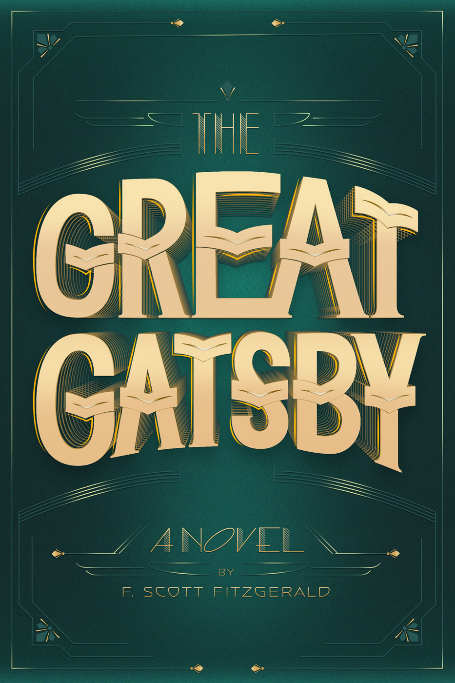
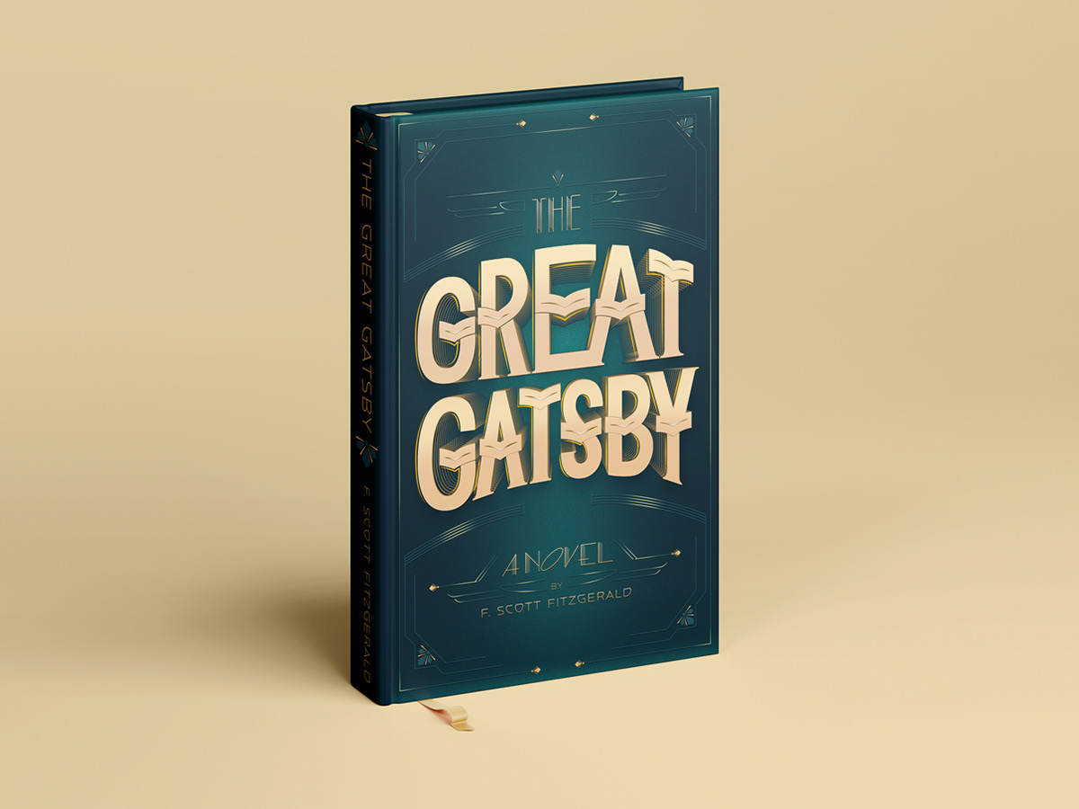
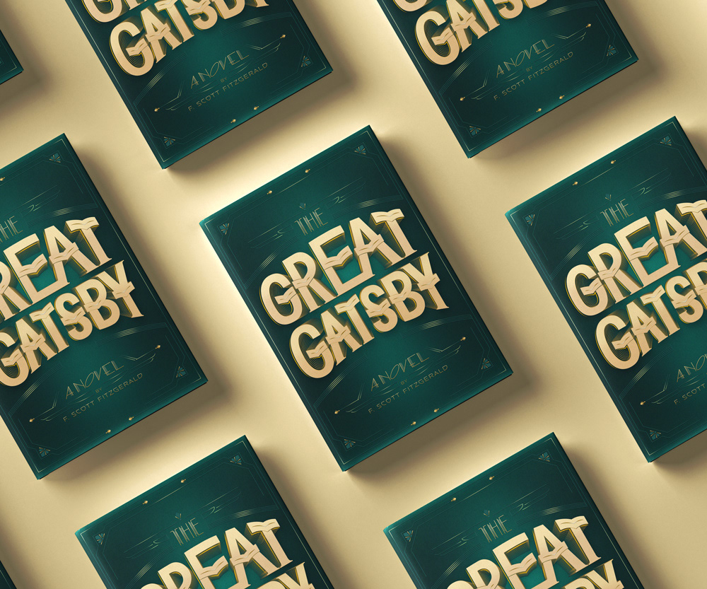
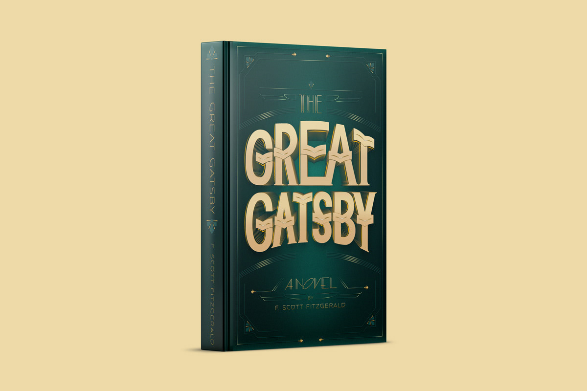
A book cover design for one of my favorite novels, created as the final project for the Lettering Seminar by Martina Flor.
The brief I set for myself was to design a cover that felt entirely typographic, no illustration, no imagery. Just lettering and ornament doing all the work. The Art Deco direction came naturally from the novel itself: the excess, the glamour, the gold. Deep teal and warm gold felt like the right combination to honor that world without being a period pastiche.
Every letterform was hand-sketched first, working through the composition, the hierarchy, and the decorative details on paper before moving to digital. The final piece was built in Illustrator, with careful attention to the layered shadow treatment that gives the title its dimensional quality.
The process