RIFF is a concept brand identity for an organic cold brew coffee company rooted in Oregon's laid-back, outdoor culture. The name plays on the idea of a riff, a spontaneous variation on a theme, capturing the brand's approach to coffee: playful, confident, and a little unexpected.
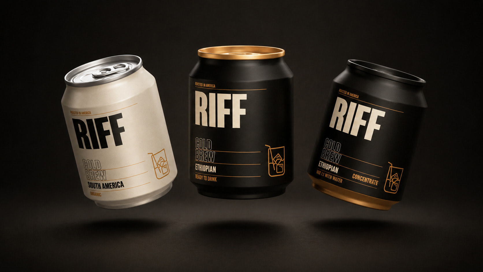
The visual identity draws from an earthy, coffee-inspired palette: deep matte blacks, warm creams, and metallic gold accents that nod to the richness of the brew itself. Bold, condensed typography gives the branding a punchy, energetic presence, while the gold linework and minimal iconography (a simple glass-and-ice motif) keep things refined rather than loud.
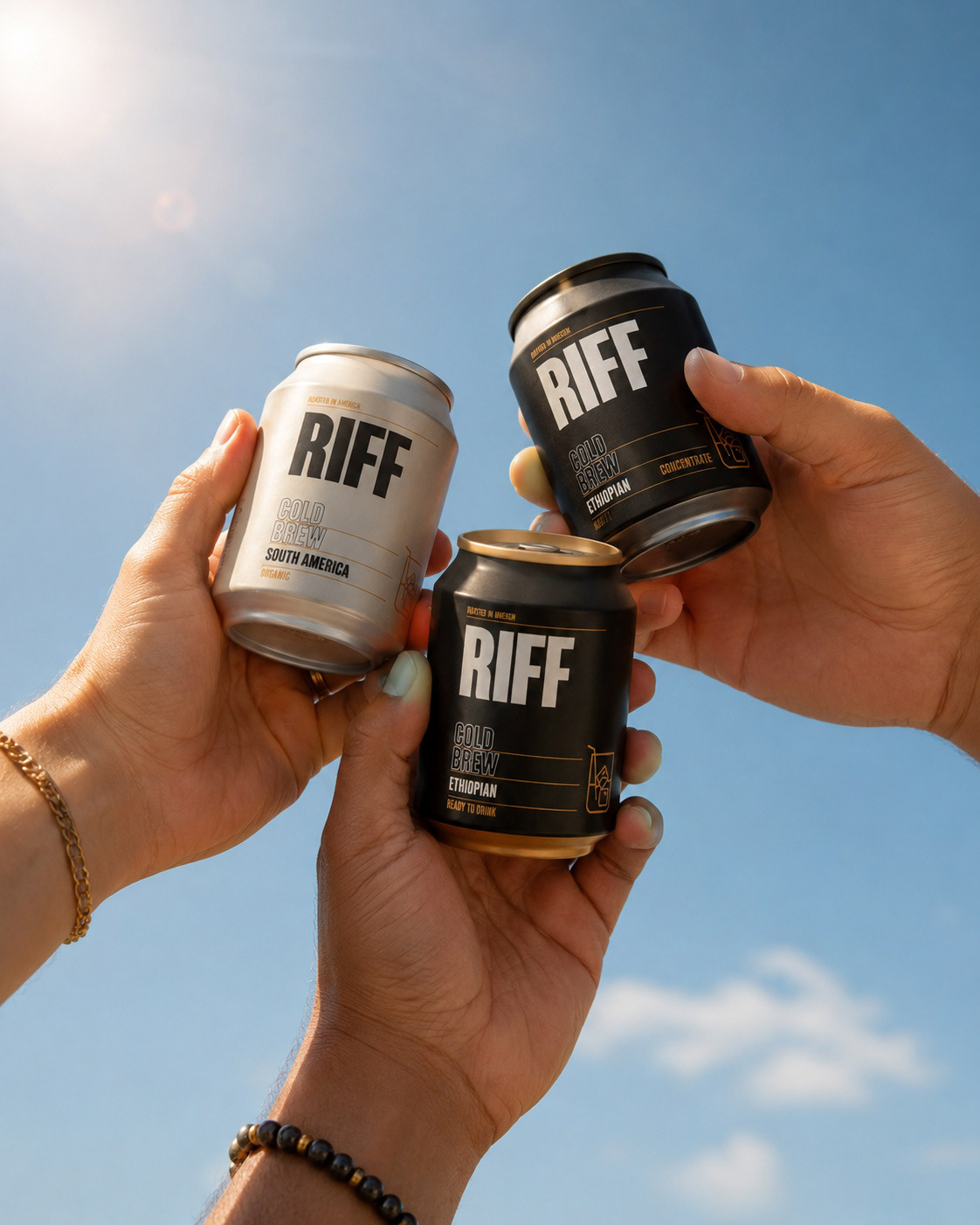
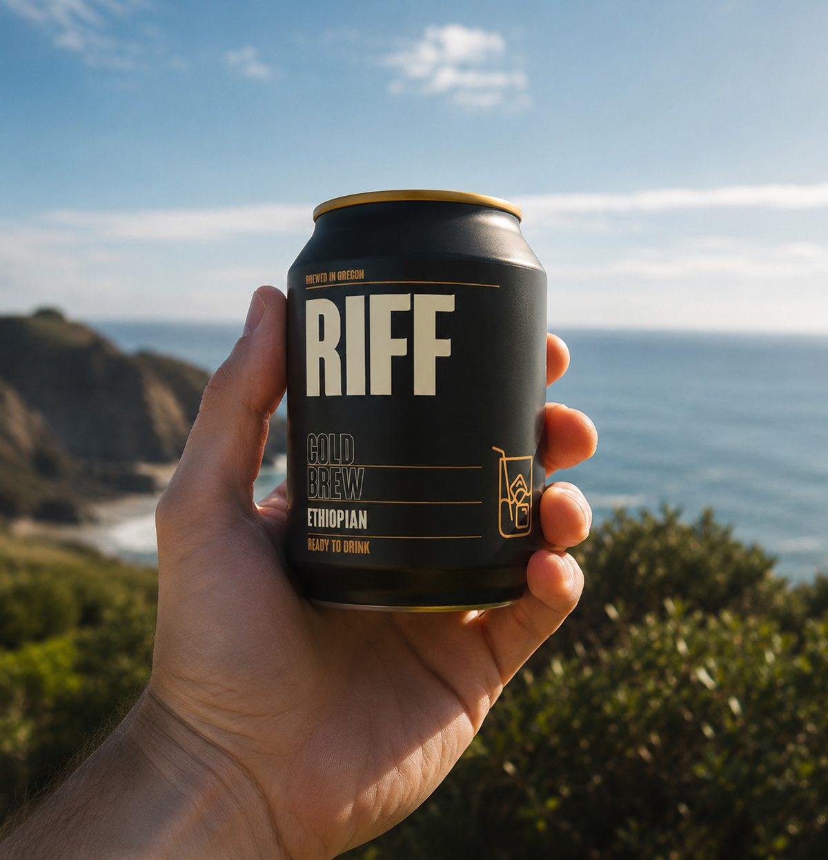
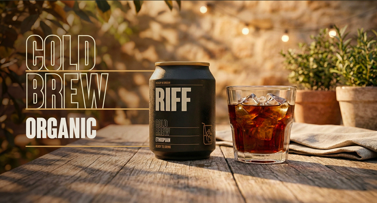
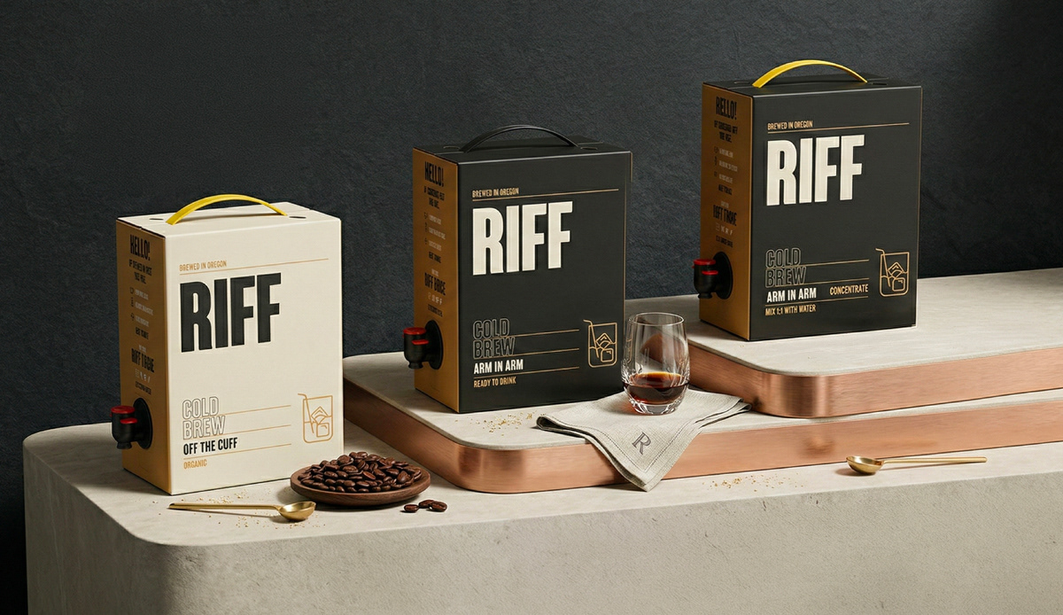
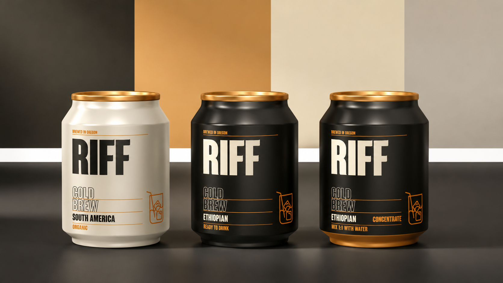
The goal was to strike a balance between fun and premium: a can you'd want to crack open on a hike or a cliffside overlook, but one that still feels considered enough to sit on a specialty shelf next to craft spirits. The packaging system extends across ready-to-drink cans, concentrate formats, and bag-in-box packaging, with consistent typography and color-coding by origin (Ethiopian, South American) to keep the range legible while giving each variant its own identity.
Ultimately, RIFF is meant to feel like the coffee equivalent of a good playlist.